Tax Management NZ
Reimagine and redesigned the whole Tax Management New Zealand platform to provide a better user experiences for our customers.
Background
Tax Management New Zealand Tax Pooling gives you the flexibility to pay provisional tax at a time that suits your business and at a much lower interest cost than what IRD charges for unpaid tax and without incurring late payment penalties.
I joined Tax Management New Zealand in the year 2019 as the Lead UX designer and have been supporting every aspect of the business and responsible for leading UX and UI across the application.
I’ve grown tremendously during the years that I was at Tax Management New Zealand, some key achievements of which I have listed below:
1. Implemented a design process ‐ This has helped our team establish more structure for how we conduct our work and allow other teams to gain visibility across our upcoming sprints.
2. Improved usability across the platform ‐ There weren’t any usability tests conducted before I joined the company. Since I have joined, I have been actively working towards conducting UX research and usability testing on all projects.
3. Established a design system ‐ This has helped the Engineering to understand how and why we choose to implement certain components over others and keep things consistent across the platform.
4. Established a product trio way of working ‐ Product trio involved 1 Team Lead Engineer, 1 Product Owner/Manager and 1 Designer. This enabled the team not only able to work more collaboratively but also to share the same outcome as a team.

Understanding the problem
Before I was hired at the company, the application that was created had no usability testing being implemented and had little consideration for the technical and product limitations on the scope of work.
I conducted 20 user research across different users (5 account managers, 8 Flexi and 7 advantage) to uncover any pain points that they were experiencing with the application. To provide some context on the type of users for Tax Management New Zealand, account managers are at the admin user level, the advantage is the premium account user and Flexi is the basic account user with limitations of the functionality of the application.
Gathering insights
After collecting the recordings from the user interviews and talking with the support team and gathering feedback from all the tickets issues that came through Freshwork which is the CRM that Tax Management New Zealand used. I have grouped the problems into common themes and features in the platform.
1. Confusion and not intuitive enough ‐ A lot of the feedback was around people who don’t know what and where to go once they come back onto the platform. The reason for this is a lot of our users are not active users which means they only log onto the application maybe every 3 months, 6 months or longer and they don’t know what to do.
2. A lot of Tax Management jargon used across the application ‐ Another issue that people are having is there is a lot of jargon being used on the application and a lot of the people don’t understand what some of the wording means.
3. Different variations of components doing the same thing ‐ There were a lot of different components around the application doing the same thing which makes the UI inconsistent, and users get confused by it. E.g., there are different types and colours of buttons and links.
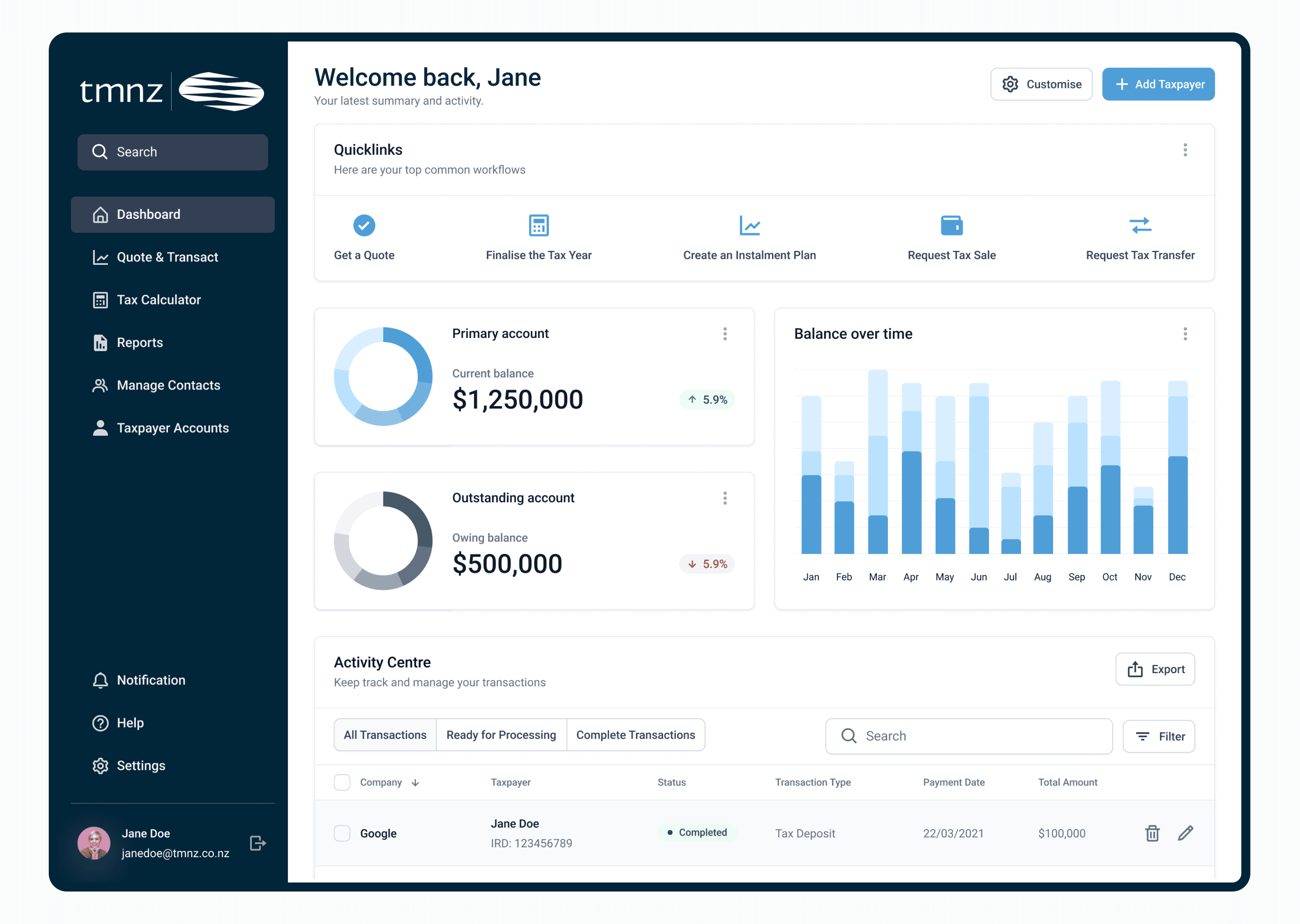
4. No balance indication on the front of the dashboard ‐ A lot of users find it frustrating having to navigate into the “Reports” section to find this information and some users don’t even know where this information they are able to retrieve from.

Wireframing
Based on the above problems identified, I worked towards addressing these pain points by coming up with potential solutions:
1. Providing top use “Quick Links” at the top of the application would allow the users to quickly navigate to a particular task they were searching for.
2. Create high-level graphs and functionality for users to be able to view their balances and outstanding balance on the front and center of the application.
3. Using the newly created design system to redesign the whole application to have everything in brand alignment and consistency.
4. Work with a copywriter and come up with different wording across the application to resonate with the users.
Validating the designs
I conducted usability testing sessions with our primary users to validate whether the new designs would solve their problems. I wrote a script including a scenario asking the user to request a quote for the amount that they would like to put into the tax pool.
During the session, I observed how they interacted with the prototype. The usability session revealed that many of the users click the quick link to request a quote and completed the process quickly. It was a success that the quick link serves its purpose by providing the users not only a quick way to navigate to a particular task but also listed on the dashboard of their top 5 workflows.


Result
Since the implementation of the new redesign of the Tax Management New Zealand platform, I have seen significant positive feedback coming through the NPS survey and the account manager told me that the clients are very happy with the new launch.