Westpac
Project that enhance Westpac One app by improving transaction information to provide users with a more efficient and user-friendly banking experience.
Background
Westpac is one of the largest and oldest banks in Australia. It is headquartered in Sydney and has a significant presence in both Australia and New Zealand. Westpac offers a wide range of financial services, including retail and business banking, wealth management, and insurance.
I joined Westpac in 2023 and has spearheaded two high-impact Mastercard initiatives to redesign and enhance the Westpac One app across web, mobile, and tablet platforms. My responsibilities included:
Leading the design and successful launch of key features for the Westpac One app, significantly improving user experience.
Developing new components and design guidelines for the RED design system to ensure consistency and efficiency.
Collaborating with stakeholders to define project scope, deliverables, and timelines, while managing multiple projects simultaneously and consistently delivering on time and within budget.
Guiding a cross-functional team of UX/UI designers, researchers, and developers through the end-to-end design process, ensuring alignment with business objectives and user needs.
Understanding the problem
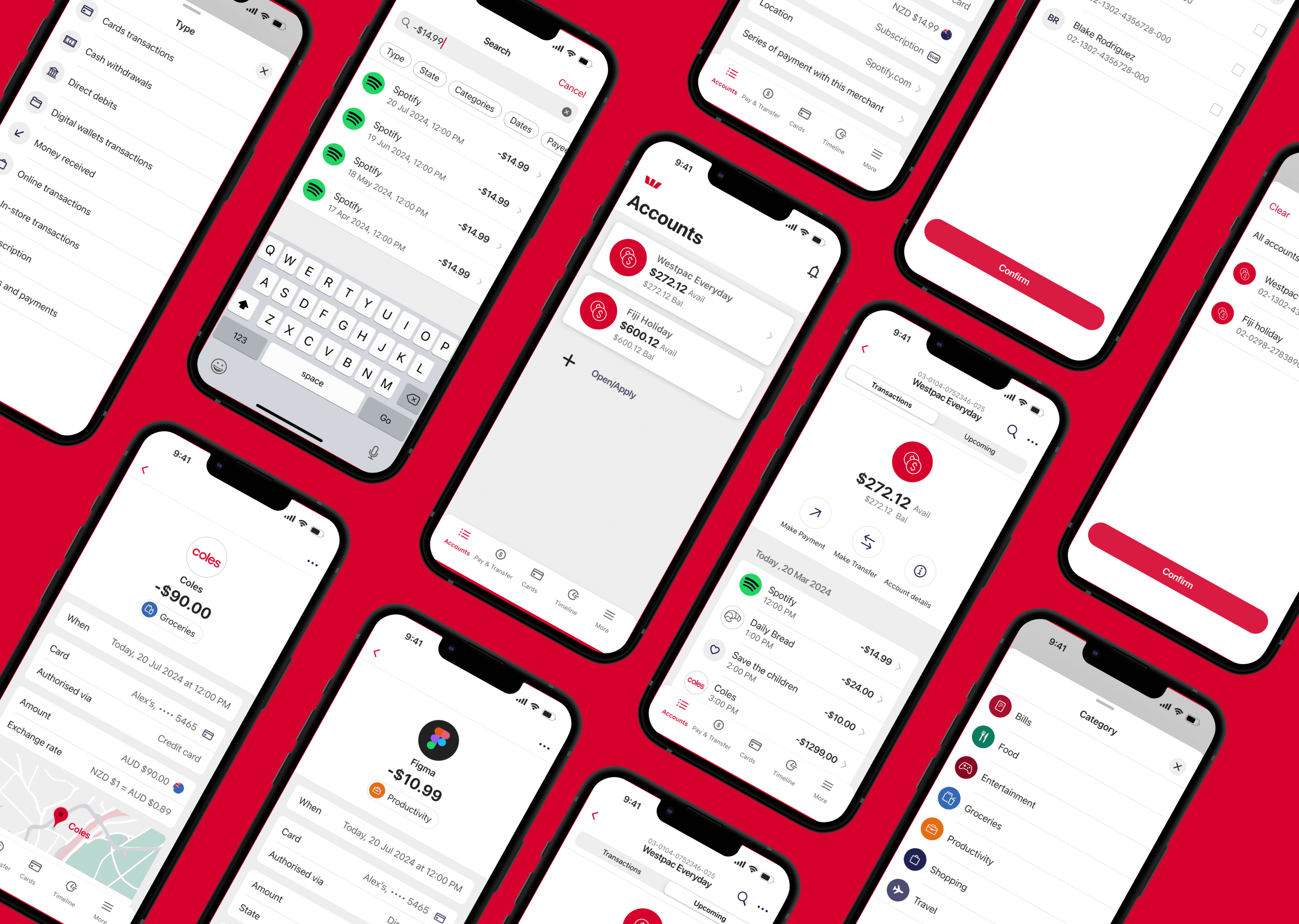
Currently, Westpac doesn’t provide enough information for each transaction and displays wrong merchant information on transactions.
When customers view a transaction on Westpac One and online banking, they encounter a lack of detailed information and inaccurate merchant details. This discrepancy often leaves customers puzzled about the recipient of their funds.
Customers who are wondering why some money is taken out from their bank account. Some of these customers are concerned and their first reaction may be to contact one of the CX channels; the Contact Centre or visit a Branch. We know this through the Edison data call drivers.
The Contact Centre is also significantly affected by the high volume of customers inquiries regarding their unclear transactions, this poor experience has a flow on affect into the Disputes form experience as well.
The goal
To deliver comprehensive transaction details - including date, time, location, accurate merchant information, and payment method to boost customer confidence and transparency. Additionally, enhance the overall user experience by improving the transaction list and search functionality for all transactions.
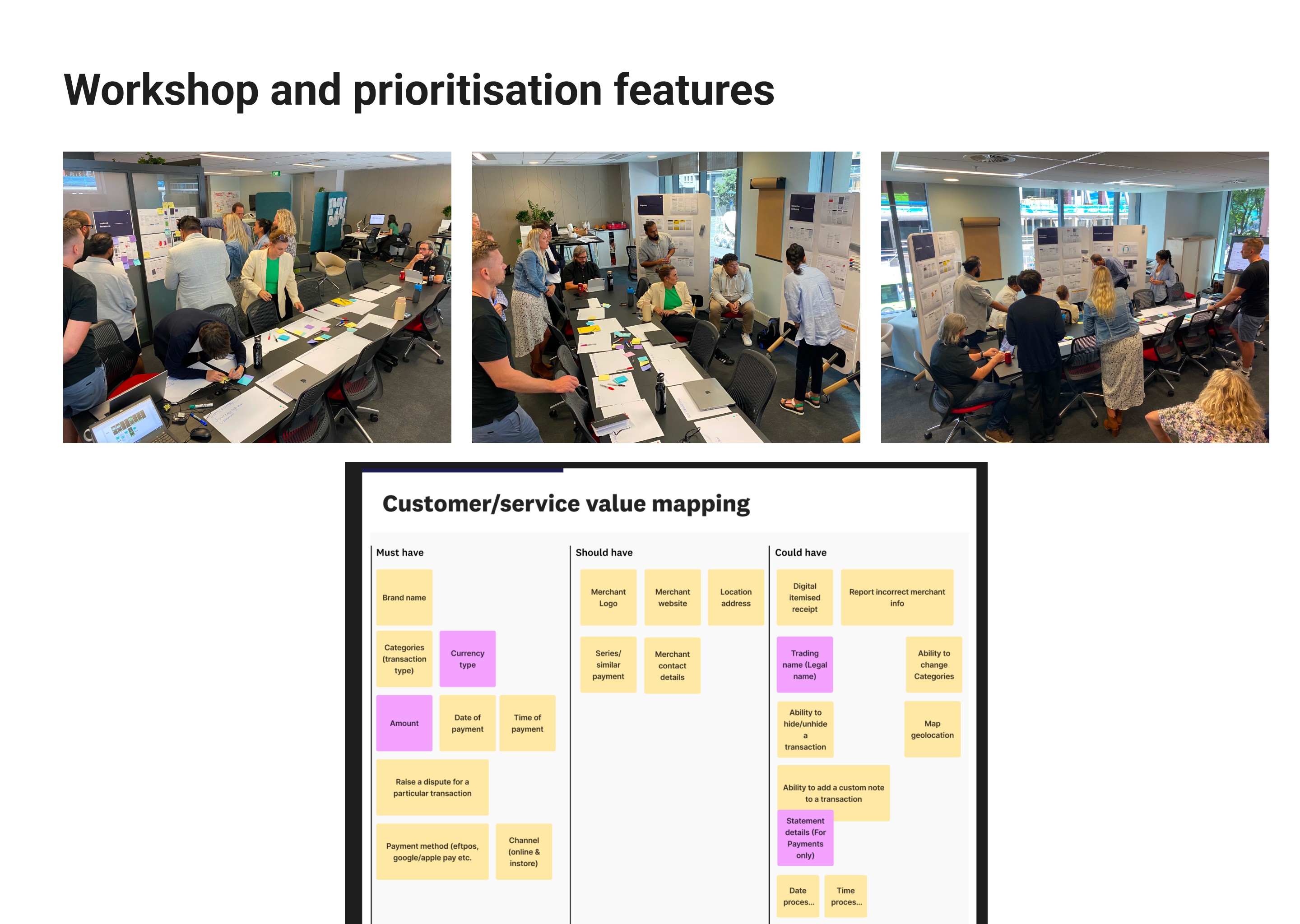
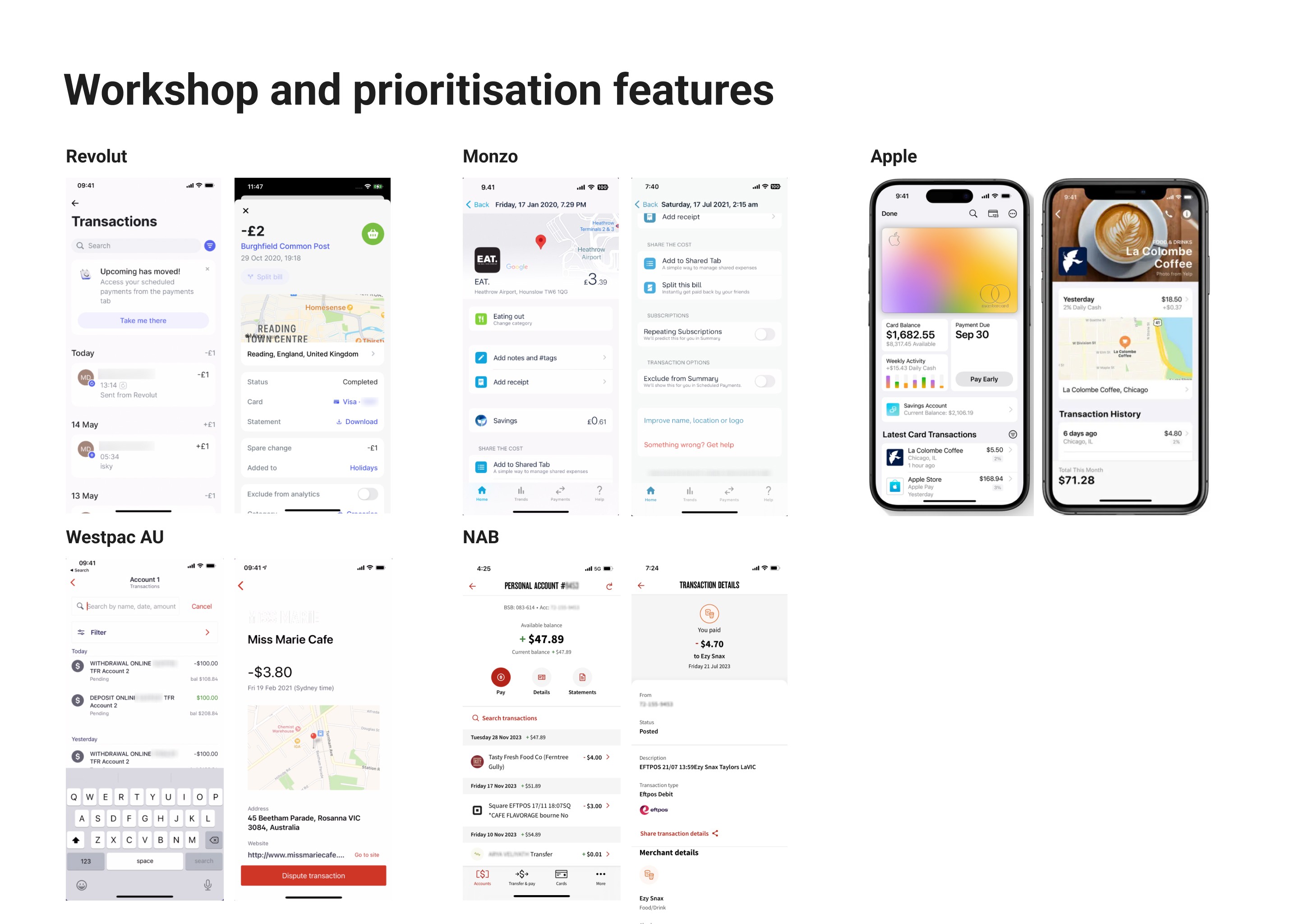
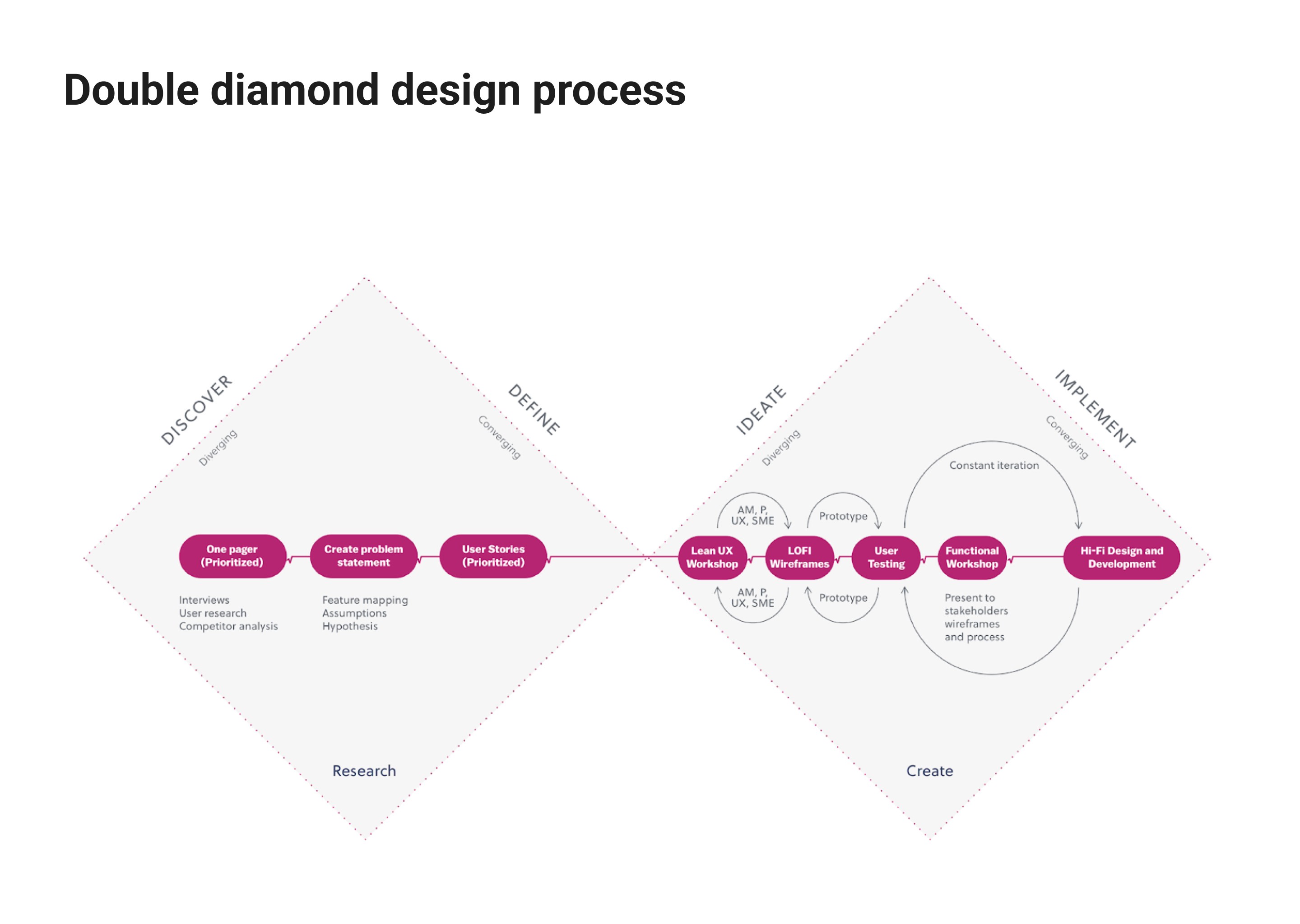
Workshop and prioritization features
My co-worker and I organized a competitor analysis workshop to gain insights into the financial market and gather stakeholder input on business requirements. This approach helped us prioritize the most crucial features for release, addressing key customer pain points. We invited frontline managers and staff to the workshop to share their daily experiences and challenges, fostering empathy among stakeholders and facilitating the prioritization of our feature list.

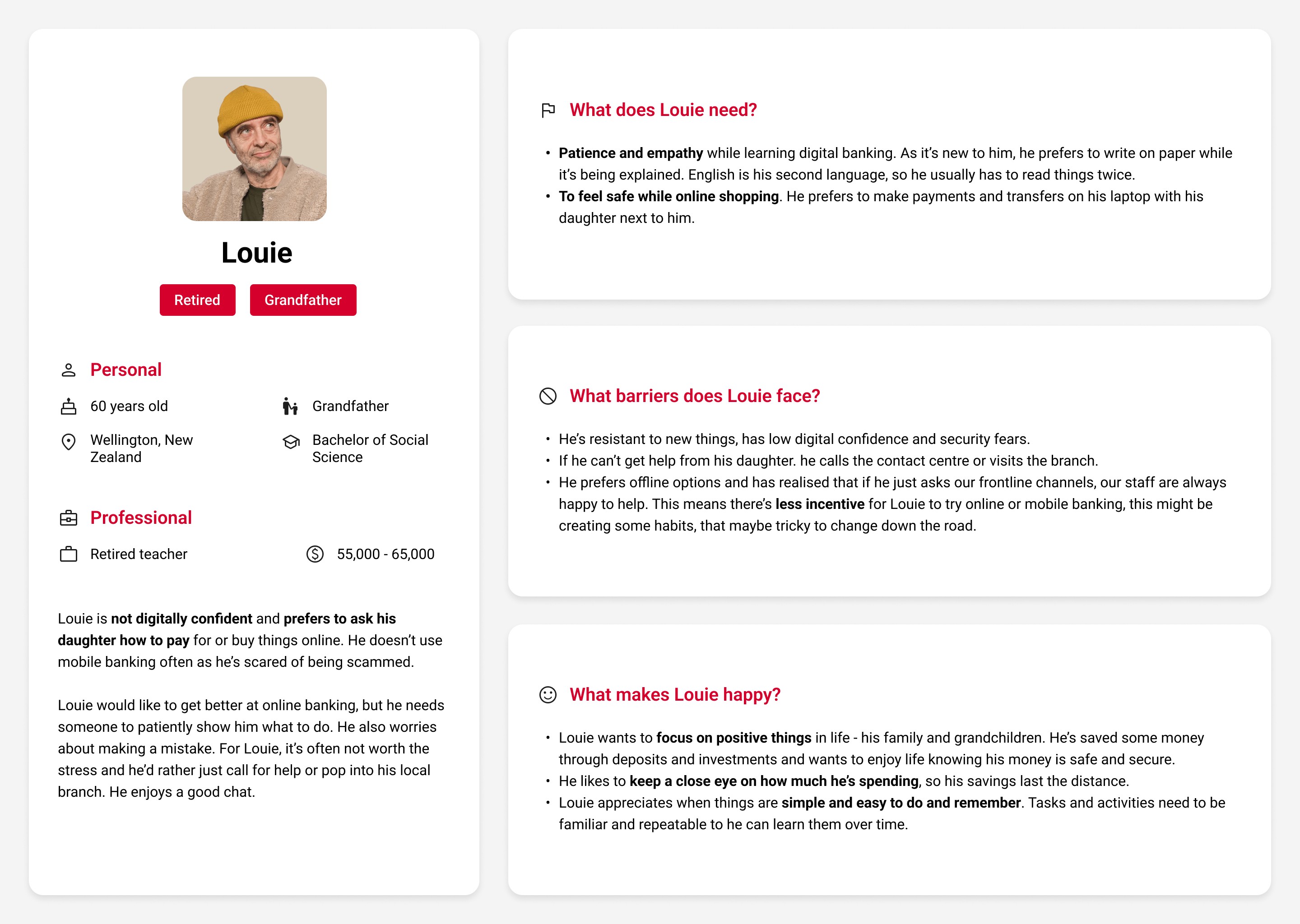
User personas
I created two user personas for the project, based on the information gathered during the workshop session, to serve as reference points.


Current state and concept testing
I led a co-design workshop with stakeholders and designers to brainstorm ideas for the project, using insights from customer pain points and business needs to guide our discussion. I then collaborated with our researcher to plan and recruit 8 participants for qualitative research. The user testing results were very positive, with a System Usability Scale (SUS) score of 90. However, a few minor adjustments were needed for the detailed high-fidelity design.
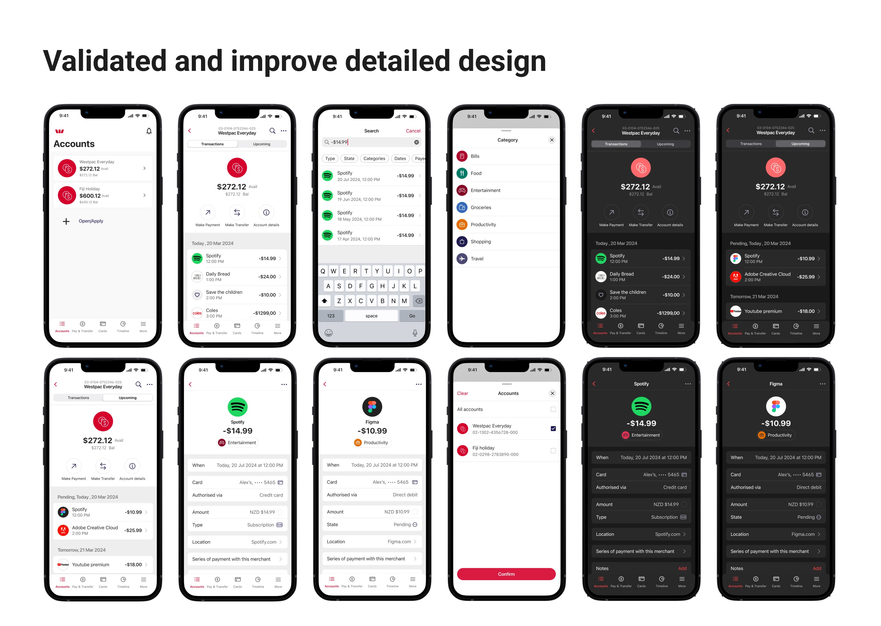
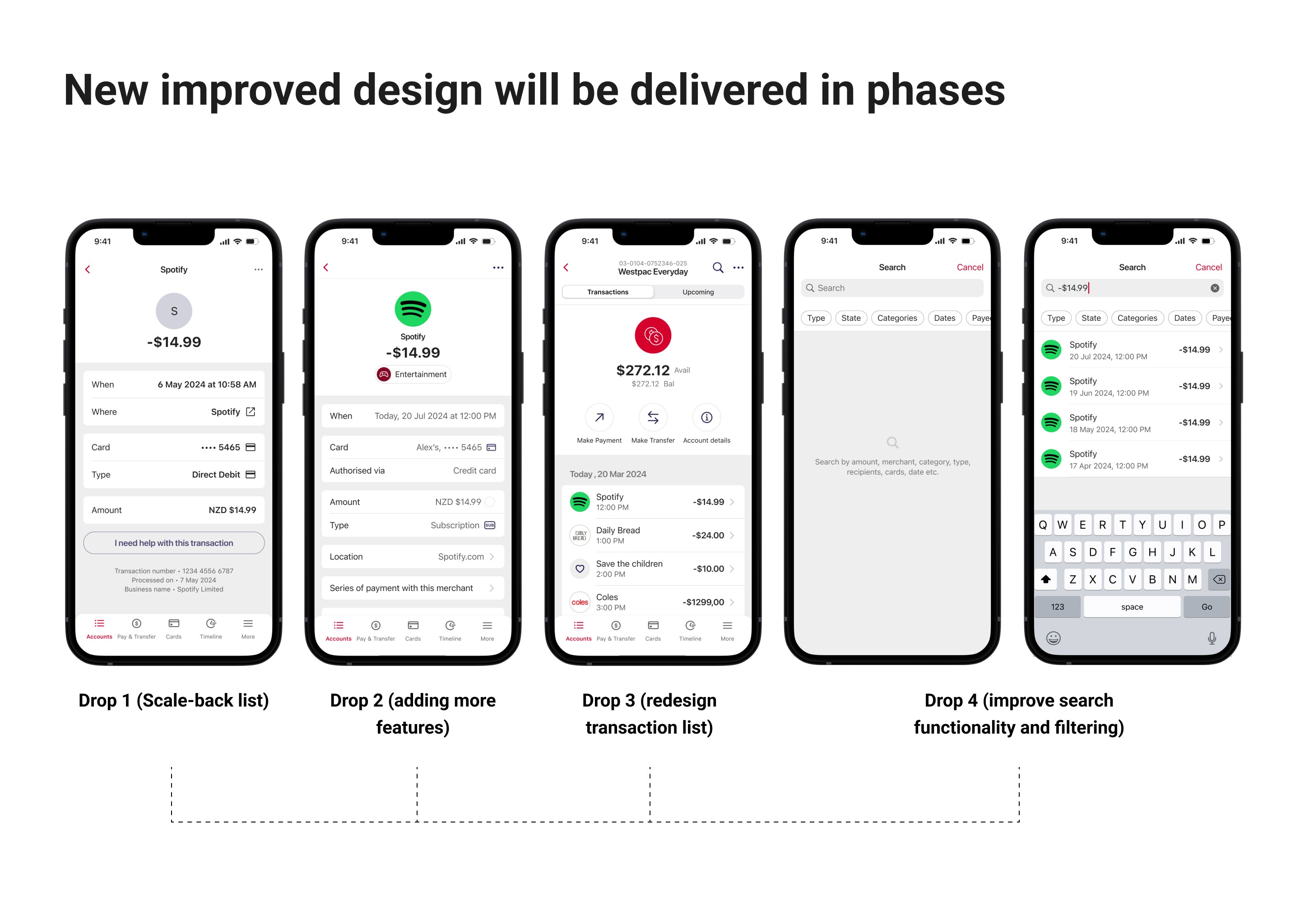
High fidelity design and project scope
I refined the design into a high-fidelity prototype and handed it over to the developers to begin development. Due to technical constraints, the project needs to be released in several phases rather than all at once. I am continuously collaborating with the developers to understand the timeline for each phase and make any necessary adjustments to the detailed design.