Improved customer outcomes by redesigning the Tax Management New Zealand platform for clearer, more intuitive management of tax pooling and provisional tax.
Company
Tax Management NZ
Timeline
2019
—
2021
Role
Lead UX Designer

Problem & Opportunity
The Challenge
The existing platform lacked structured UX consideration, with inconsistent UI components and unclear terminology that confused infrequent users.
Users often logged in only a few times per year and struggled to navigate or complete key tasks due to information overload and poor interface structure.
Opportunity
Create a more intuitive experience by redesigning key workflows, simplifying language, and establishing design consistency by improving task completion, reducing cognitive load, and boosting user confidence in tax management workflows.
Leadership & Strategy
Stakeholder Alignment & Discovery
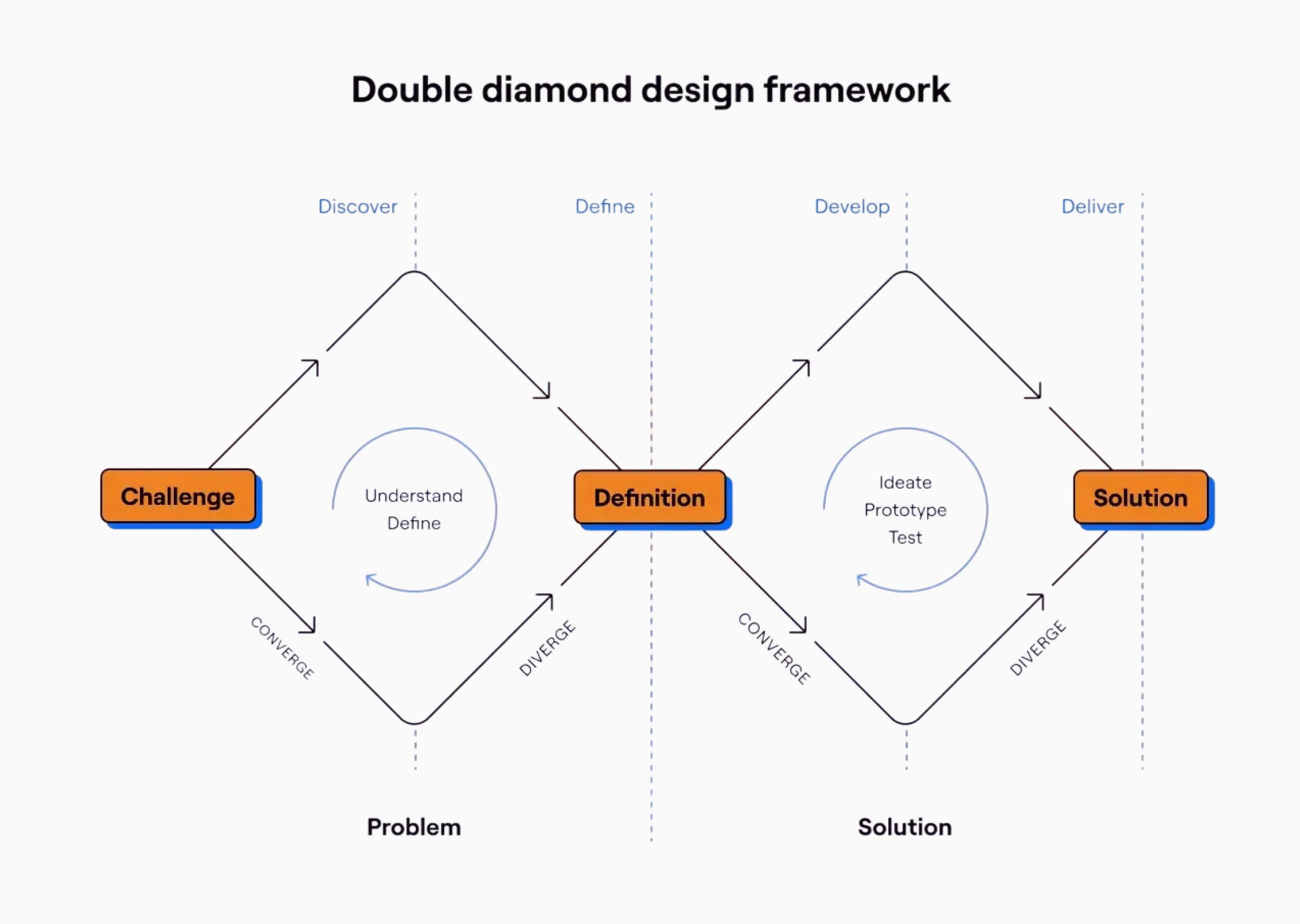
Introduced a structured UX design process to bring clarity, visibility and predictability to how design work was planned and executed.
Formed product trios (designer, engineer, product owner) to improve alignment on solutions and outcomes and ensure shared ownership of delivery.
User-Centred Research
Conducted 20+ user interviews across different user types (account managers, basic users, premium users) to uncover pain points and understand workflows.
Synthesised research alongside CRM (Freshwork) support data to prioritise experience issues like confusion in navigation, unclear labels, missing balance information, and inconsistent UI patterns.
Iterative Prototyping & Testing
Grouped common user issues into themes (navigational confusion, jargon overload, UI inconsistency, lack of key financial indicators upfront).
Facilitated internal workshops to align stakeholders and prioritise improvements based on impact and feasibility.
Created wireframes and high-level UX proposals to address core pain points, such as adding quick links, dashboard summaries, and consistent UI components.
Conducted usability testing sessions to validate solutions and refine flows before development.
Design System Contribution
Built a centralised design system to enforce consistency, reduce rework, and guide development implementation across the platform.


Key UX Solutions
Enhancements Included
Navigation & Onboarding
Introduced a Quick Links section on the dashboard to help users rapidly access their most common tasks without hunting through menus.
Dashboard Redesign
Centralised high-level graphs and balance indicators on the homepage to surface critical financial information at a glance, addressing feedback that key data was too buried in reports.
Language & Clarity
Collaborated with content specialists to simplify tax language and reduce jargon, making the workflows easier to understand for non-specialist users.
UI Consistency
Standardised button styles, link behaviours, form patterns, and spacing rules to reduce confusion caused by inconsistent components.
Outcomes
Impact
Stronger Usability
Post-redesign feedback showed significantly improved usability and clarity with users able to complete key tasks more efficiently and confidently.
Positive User Feedback
NPS and qualitative interviews after launch indicated that clients and account managers found the redesigned platform easier to navigate and understand.
Design System & Team Efficiency
Design system adoption helped maintain consistency as new features were added and reduced design rework across the team.


Reflection & What’s Next
What I learned
What I Learned
Structured design processes and early design system adoption improved cross-team alignment, reduced ambiguity, and enabled the product to scale more effectively.
Investing in user research even with infrequent users surfaced deeply held pain points that directly informed high-impact improvements.
What’s Next
Continue refining dashboard insights and context-aware guidance to support users new to tax pooling.
Expand design system documentation to speed up designer onboarding and ensure long-term consistency.


Improved customer outcomes by redesigning the Tax Management New Zealand platform for clearer, more intuitive management of tax pooling and provisional tax.
Company
Tax Management NZ
Timeline
2019
—
2021
Role
Lead UX Designer
Problem & Opportunity
The Challenge
The existing platform lacked structured UX consideration, with inconsistent UI components and unclear terminology that confused infrequent users.
Users often logged in only a few times per year and struggled to navigate or complete key tasks due to information overload and poor interface structure.
Opportunity
Create a more intuitive experience by redesigning key workflows, simplifying language, and establishing design consistency by improving task completion, reducing cognitive load, and boosting user confidence in tax management workflows.
Leadership & Strategy
Stakeholder Alignment & Discovery
Introduced a structured UX design process to bring clarity, visibility and predictability to how design work was planned and executed.
Formed product trios (designer, engineer, product owner) to improve alignment on solutions and outcomes and ensure shared ownership of delivery.
User-Centred Research
Conducted 20+ user interviews across different user types (account managers, basic users, premium users) to uncover pain points and understand workflows.
Synthesised research alongside CRM (Freshwork) support data to prioritise experience issues like confusion in navigation, unclear labels, missing balance information, and inconsistent UI patterns.
Iterative Prototyping & Testing
Grouped common user issues into themes (navigational confusion, jargon overload, UI inconsistency, lack of key financial indicators upfront).
Facilitated internal workshops to align stakeholders and prioritise improvements based on impact and feasibility.
Created wireframes and high-level UX proposals to address core pain points, such as adding quick links, dashboard summaries, and consistent UI components.
Conducted usability testing sessions to validate solutions and refine flows before development.
Design System Contribution
Built a centralised design system to enforce consistency, reduce rework, and guide development implementation across the platform.
Key UX Solutions
Enhancements Included
Navigation & Onboarding
Introduced a Quick Links section on the dashboard to help users rapidly access their most common tasks without hunting through menus.
Dashboard Redesign
Centralised high-level graphs and balance indicators on the homepage to surface critical financial information at a glance, addressing feedback that key data was too buried in reports.
Language & Clarity
Collaborated with content specialists to simplify tax language and reduce jargon, making the workflows easier to understand for non-specialist users.
UI Consistency
Standardised button styles, link behaviours, form patterns, and spacing rules to reduce confusion caused by inconsistent components.
Outcomes
Impact
Stronger Usability
Post-redesign feedback showed significantly improved usability and clarity with users able to complete key tasks more efficiently and confidently.
Positive User Feedback
NPS and qualitative interviews after launch indicated that clients and account managers found the redesigned platform easier to navigate and understand.
Design System & Team Efficiency
Design system adoption helped maintain consistency as new features were added and reduced design rework across the team.
Reflection & What’s Next
What I learned
What I Learned
Structured design processes and early design system adoption improved cross-team alignment, reduced ambiguity, and enabled the product to scale more effectively.
Investing in user research even with infrequent users surfaced deeply held pain points that directly informed high-impact improvements.
What’s Next
Continue refining dashboard insights and context-aware guidance to support users new to tax pooling.
Expand design system documentation to speed up designer onboarding and ensure long-term consistency.